Goldwise
Providing an easy to use precious metal investments and purchase to traders
Goldwise is a fintech and precious metal trading platform, a destination for investors to purchase precious metals of their choice with ease. I led the UX for simplifying user-flows, immersive UI experience and product market roadmap strategy.
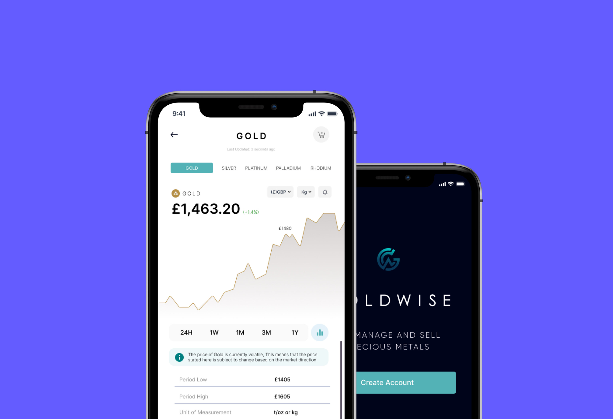
I designed a mobile app that allows investors to easily purchase and invest in precious metals of their choice across the world. Investing in precious metals such as Gold, Silver, Platinum, Rhodium and Palladium can be quite hectic as industry knowledge is limited, mostly due to low level of information about how precious metals trading works, the key trading parameters and indices such as; the Gain Points, Period Low and Period High and also the technical know how on general trading.
GoldWise aim to solve that problem by developing a simple and easy to use platform where buyers/investors of different industry knowledge level, from experts to novice can invest easily within the shortest period of time.
The Problem
Finding a reliable, simple and secured trading platform for purchase and investment of precious metals.
The Solution
An app that takes into consideration different demographics of traders that needs a reliable and secured platform for their precious metals trading.
My Role
Lead on research, design thinking, production, and validation.
I. Discover
Switching to Detective Mode
The best detectives like to get their hands dirty. They know people in and out, can place themselves in the other’s shoes, and can gather from patterns what the correct solution is. But none of this can happen without observation and listening.Similarly, the discovery phase of this project led me from stepping into the world of precious metals trading and purchase to getting to know the niche precious metals world, gathering information and insight. Finally, finding common patterns which led to a solution.
Attitude
At this point, it’s best if you join me in removing our solution hat. This is a stage of listening and observing, allowing ourselves to be hit by the state of affairs and accepting it without wanting to change anything. Don’t worry, later we’ll put on the solution hat, but for now, we’re purely on receiving mode.
Methodologies
For the discovery process, I used numerous different research methods: observation, brainstorming, secondary research, divergent and convergent thinking, and affinity mapping, user survey, user interviews, empathy mapping, personas, and journey mapping.
Process
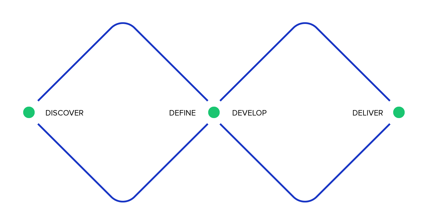
The overarching discovery process began with understanding then defining the problem area. Next came research, and finally, a synthesis of the research findings.Throughout this stage, I used a perpetual cycle of convergent and divergent thinking referenced above as Double-Diamond Design Process, this was adopted as a result of complex problem we are trying to solve while maintaining an empathic mentality.
Defining the Problem | Researching | Synthesizing |
| The gray zone on precious metals investments, purchase of digital or physical metals and investing in digital metals. | Getting amongst it with facts, figures, and feelings related to the problem area. | Finding patterns and structure within the research results. |
Defining the problem
To kickstart this project I had series of meetings with the product owners where app requirements were defined and also an avenue for me to ask some specific question bothering more on the following: Who are we building for?Why are we building this app?What is the solution we are offering?, What makes us different from others?With these answers provided accurately and well detailed by the product owners, I was able to have a very clear idea of the product requirements and expectations from me, upon that I proceeded to the next phase of the project, conducting independent research into the people we are designing for.
Researching
In the research phase, I submerged myself in information regarding metals investments and experienced traders, first through secondary research, articles, studies, and reports, and second through primary research of user surveys and testing.
White Paper Research
The first step I took was researching what others have found regarding the matter. Without dragging you through too much detail, this is what I found. (Information has been synthesized.)Over the years about 60% of middle income earners fall victims of illegal/fraudulent trading platforms, resulting into estimated $5bn loss in the economy, the market has a potential of about 150million future customers over the globe. GoldWise intend to launch a pilot in Europe and expand globallyTo put this in context, one study points out that half of the investments in precious metals sector are made by middle income earners, which created one-third of jobs in the trading sector between 2000-2017. Not only does precious metal trading sector account for 50% of jobs in the commodity exchange transactions , but it also is highly influential on world trading economics, businesses of the wealth, top income earners, upper class middle class and Commodity Exchange companies. The health and wellbeing of the trading economy as a whole are tied up in volatility of precious metals.Since the start of new age of trading, there has been a decline in purchase of physical metals due to other commodity exchange such as cryptos These majorly affected top precious metal exchange platform, hence an introduction of e-precious metals purchase called the digital metal, this allows a user buy a fraction of a metal and get stored as a value while retaining same trading parameters of buying and selling.Concluding from this data, clearly, a key factor in the survival of precious metals investment and purchase depends on their ability to democratize purchase i.e Digital Metal.Finally, and perhaps the most shocking, is the data that roughly 36% of precious metals trading platform do not offer digital metal investments.
Primary Research
My primary research for this project consisted of a screener survey and user interviews with the objective of discovering how the mobile app could be more helpful to investors/traders of precious metals. I spoke to 5 current traders and newbies investors in various trading knowledge demographics, guiding the conversations with these questions.
Screener Survey
To get as wide a test pool as possible for the screener survey, I targeted precious metals traders(Gold and Silver, etc) Facebook groups and my network for those in the field. From those who responded, I selected 6 participants for user surveys based upon their interest and their familiarity/unfamiliarity with having a web presence.
User Interviews
The user interviews were conducted remotely over Zoom. The 6 participants were all precious metals traders with an average years of 5, 10 and 35 years. Only one is a newbie investor with less than one year experience in metals trading.
I asked 8 questions which are as follows.
- What was your experience trading precious metals?
- How did you learn about the app you used to purchase your metals?
- What caused stress in the process?
- How many accounts do you have connected to your trading account?
- How do you feel about the process of keeping track with market updates?
- Are there ways that a website has helped you?
- What do you like about your current trading app?
- What is the biggest pain point you experience trading?
Synthesis
After conducting in-depth user interviews, I synthesized my research findings by observing research findings for common patterns and themes. I did this with an affinity map, an empathy map, competitor analysis, compiling a persona, and finally, user journey map, using these resources and composing a leading “how might we” statements to kickstart the solution process.
Affinity Mapping
Using the notes from the user interviews, I created an affinity map to find. A few patterns emerged.
- Their experience trading on a precious metal platform
- Their current platform
- Attitudes
- Pain points
- Desires
Empathy Mapping
Using the information from the affinity mapping process, I created an empathy map to consolidate and organize the patterns uncovered from the user interviews.As is in the name, this process further deepens the understanding of the user and helps with the next phase of creating a persona.
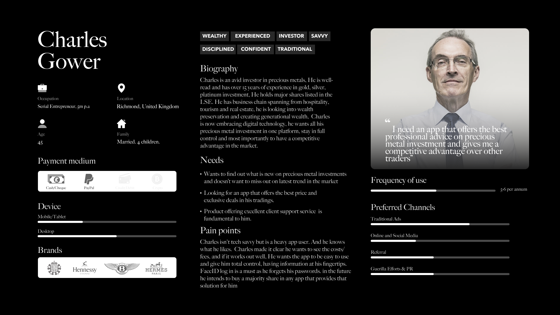
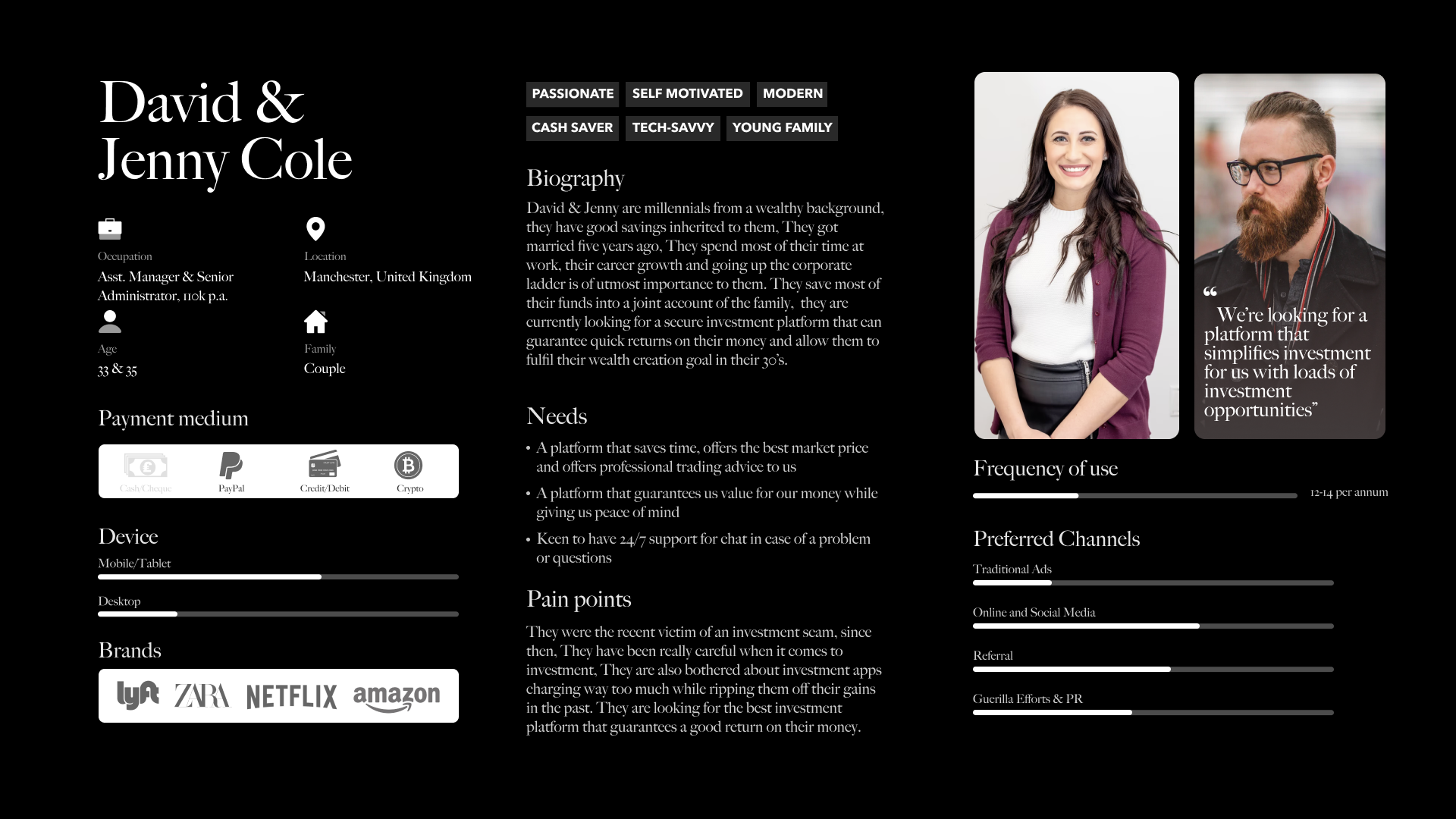
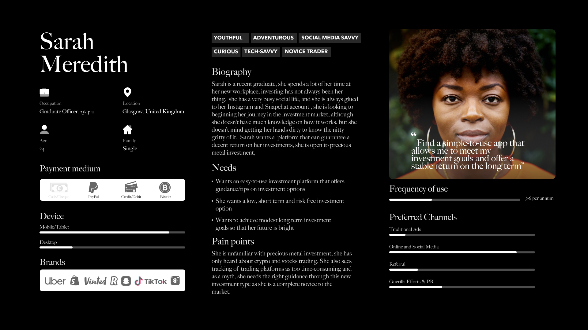
User Persona
A compilation of all essential patterns and commonalities uncovered during the user interviews and refined through affinity and empathy mapping, let me introduce Charles, David & Jenny and Sarah. Charles is our lead user which this project will solve for, a sounding board for the next step in the process, designing a solution, and overall the project’s north star.With this clear idea of who the design is for, I then had enough information to flesh out possible solutions.
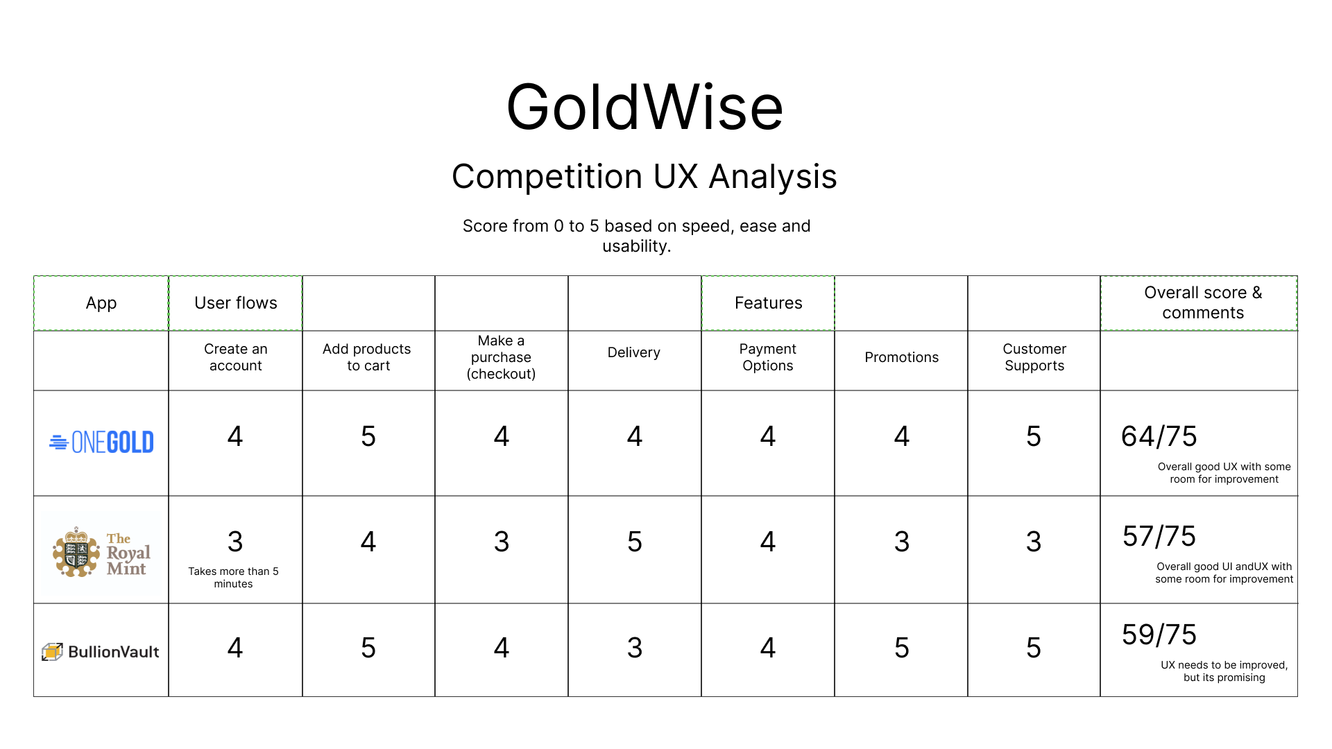
Competitor Analysis
Holistic analysis of top 3 competitors
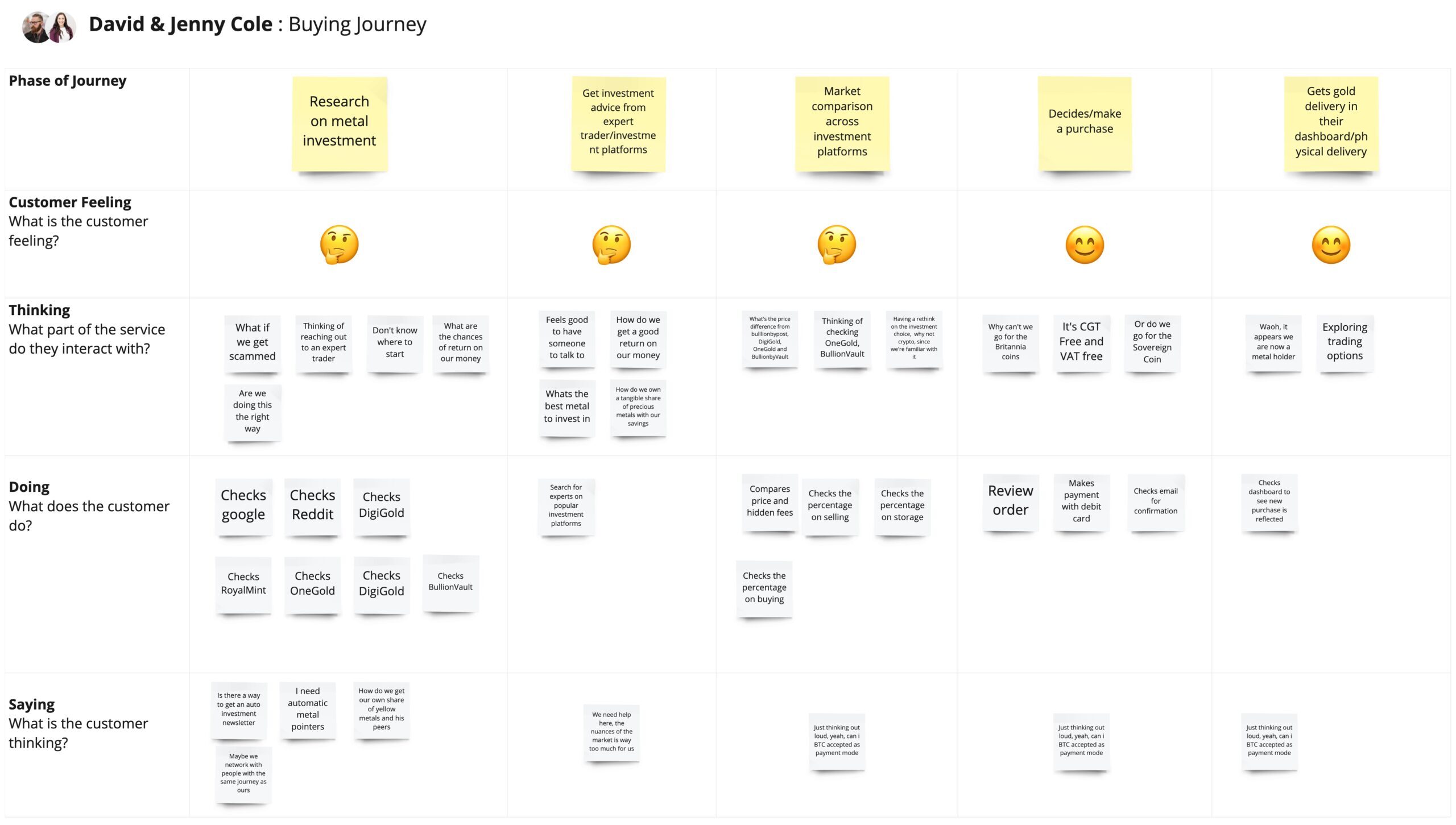
User Journey Map (Buying)

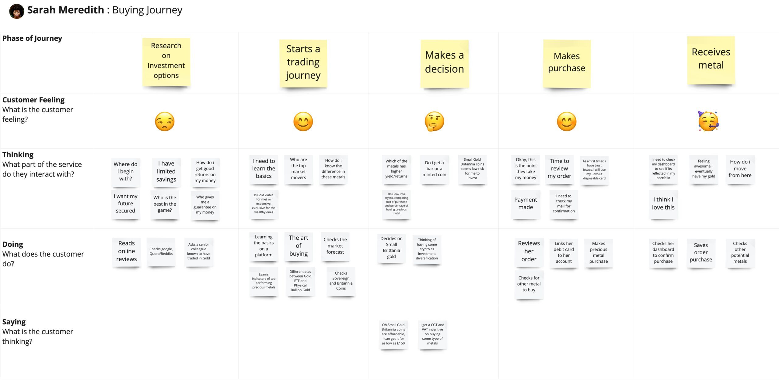
Solving for Charles
With Charles in mind, I started brainstorming solution ideas to address some need of Charlie’s and came up with 5 possible solutions using the “how might we” process.
- How might we reduce the amount of time an avid investor spend in researching about the right metal to invest and buy
- How might we support the mid level knowledge investors in purchasing and investing in profitable metals
- How might we reduce the amount of time precious metal traders spend on running and managing multiple trading platforms?
- How might we integrate the many elements of running a trading account?
- How might we reduce the number of tools/parameters used in trading forecasts?
All of these are related to the two major patterns discovered in the affinity mapping process, a) the buying, selling of a precious metals and investments and b) the safe delivery of a preferred physical metalsI decided to solve for solution no. 1. My reasons are as follows: buying, selling and investing in precious metals depends on having an extensive technical know how and operating a verified financial account. Also, a common thread in research findings was the amount of time that it took and the uncertainty that came along with it to find the right platform fit.Solving for how precious metals traders can easily and quickly buy, sell or invest in any metal of their choice is the minimum viable product that can easily be built upon in the future.With this decided, I could move on to designing.
"How might we enable users to find the right
investment and purchase precious metals
of their choice with ease?"
The Solution Question
II. Design
Bringing the research to life
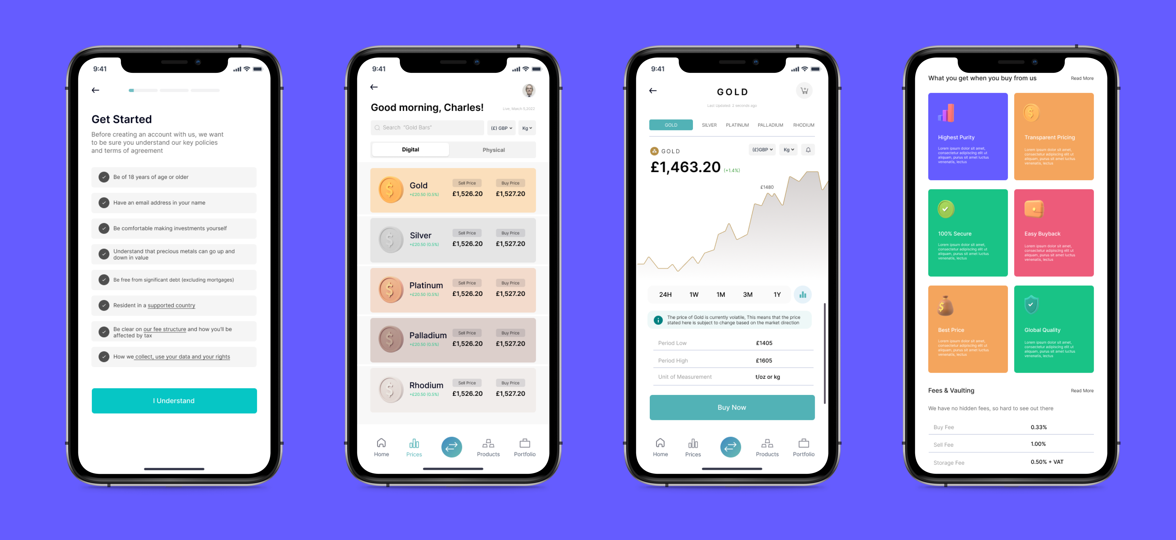
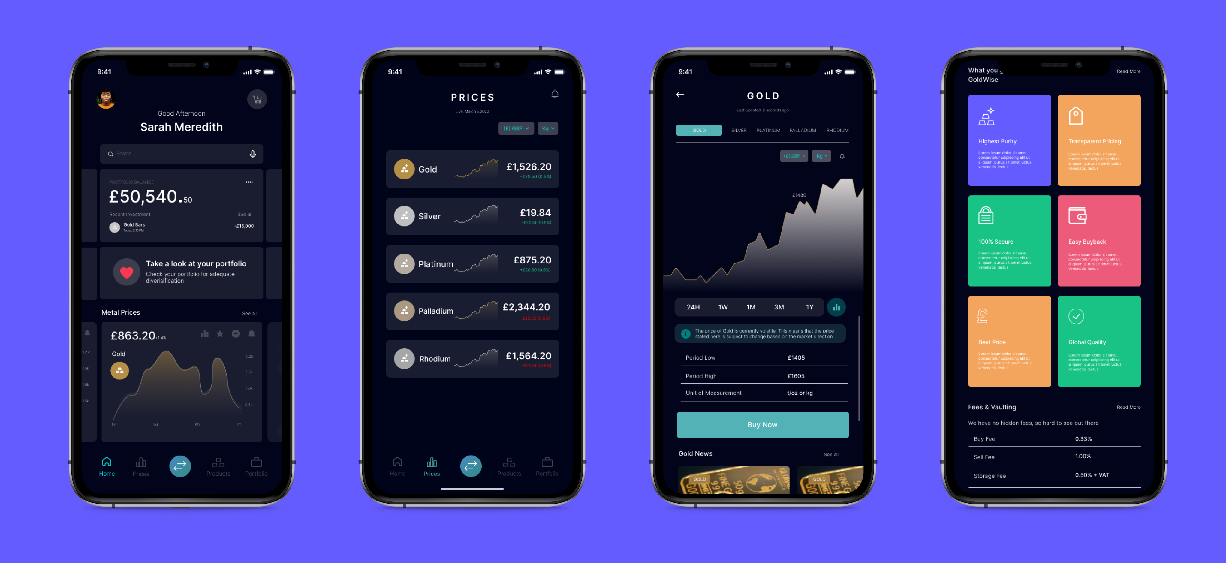
Research is great but kind of pointless if nothing is done about it. In this next stage of the process, I started designing a solution based upon Charlie and the “how might we” statement.In this stage, there are two types of design. 1) Usability Design and 2) Visual Design. One determines how things will function and the other determines what it will look like.
Usability Design
I started the design process with usability design. After all, you can make something look good if it doesn’t exist.I designed for usability through ideation, information architecture, sketching and guerilla testing, and wireframing.
Ideating
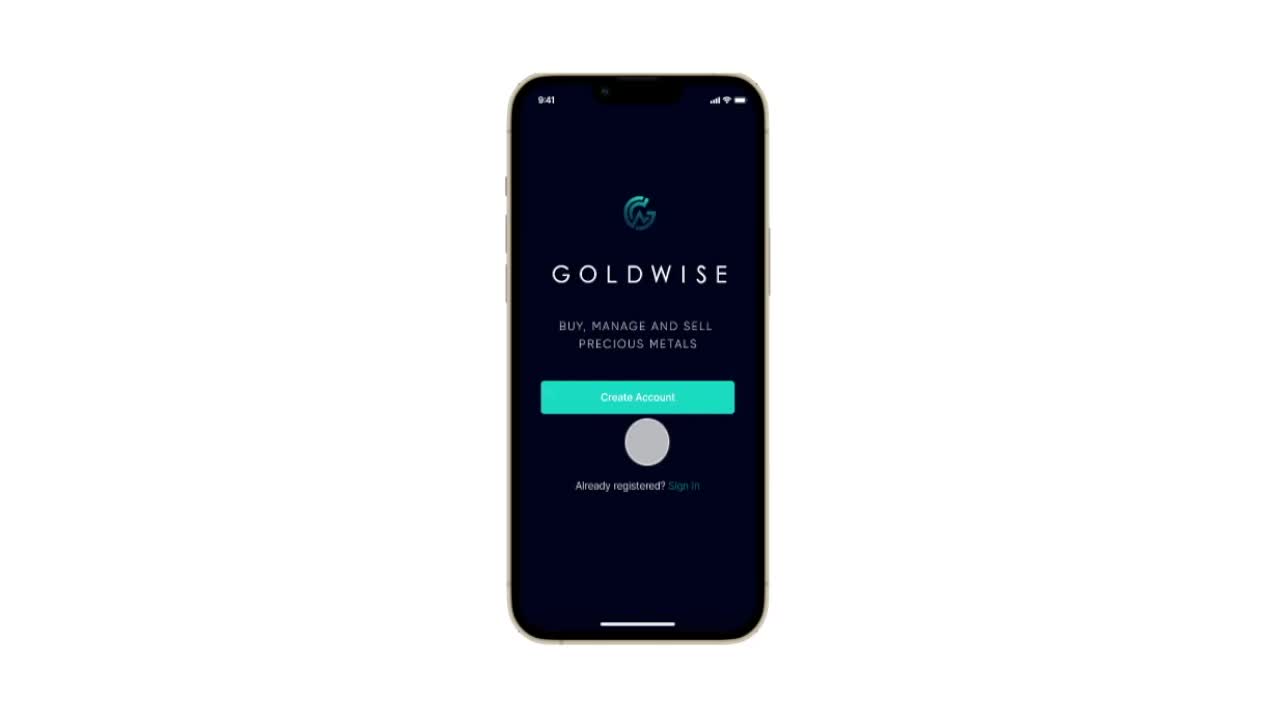
In this stage of the process, I brainstormed for product ideas for Charlie’s issue.I settled on a “GoldWise starter kit” – a resource giving a personalized plan and resource guide for setting up a trading account based upon experience level, preferences, time, and financial budget.
Information Architecture
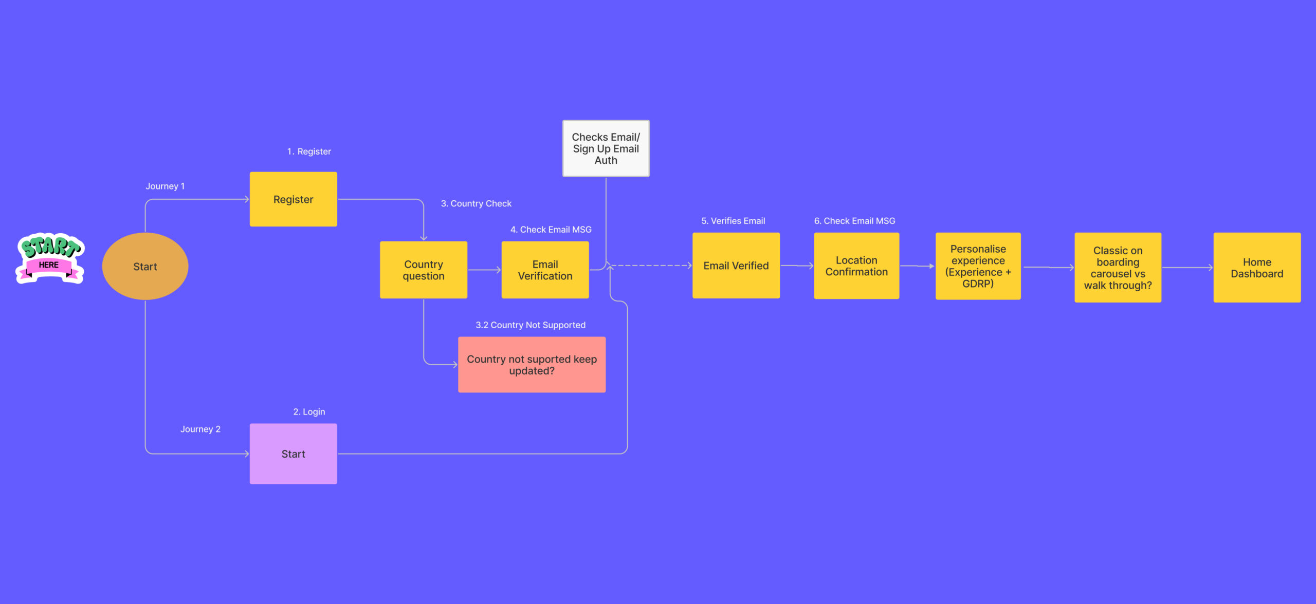
In this process, I made a site map and user flows for critical routes to aid users navigation and also to guide the usability design processes.

Sketching and Guerilla Usability Testing
Sketching is the first step in bringing the solution to life followed by guerilla usability testing to make sure that flows were functional.
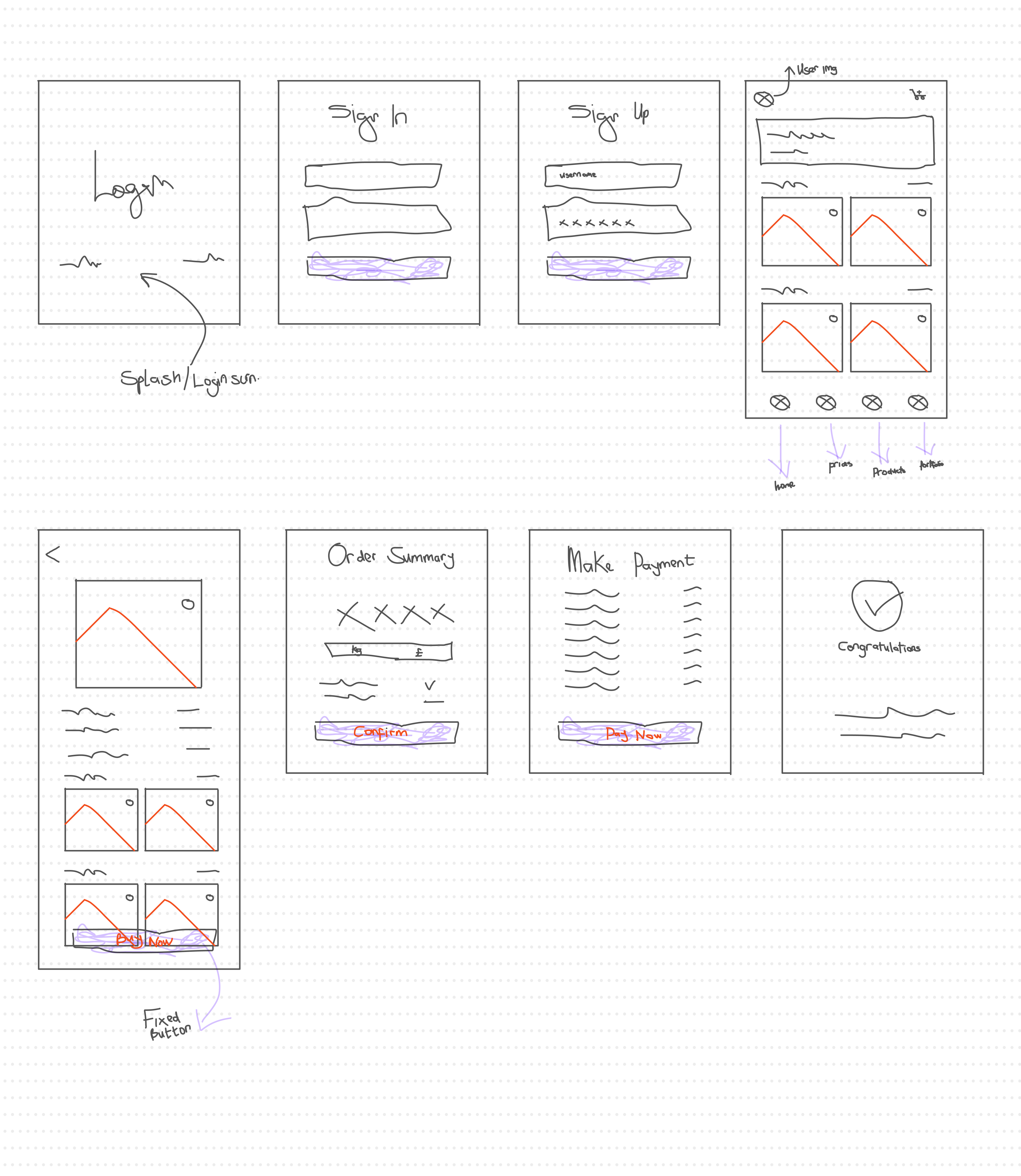
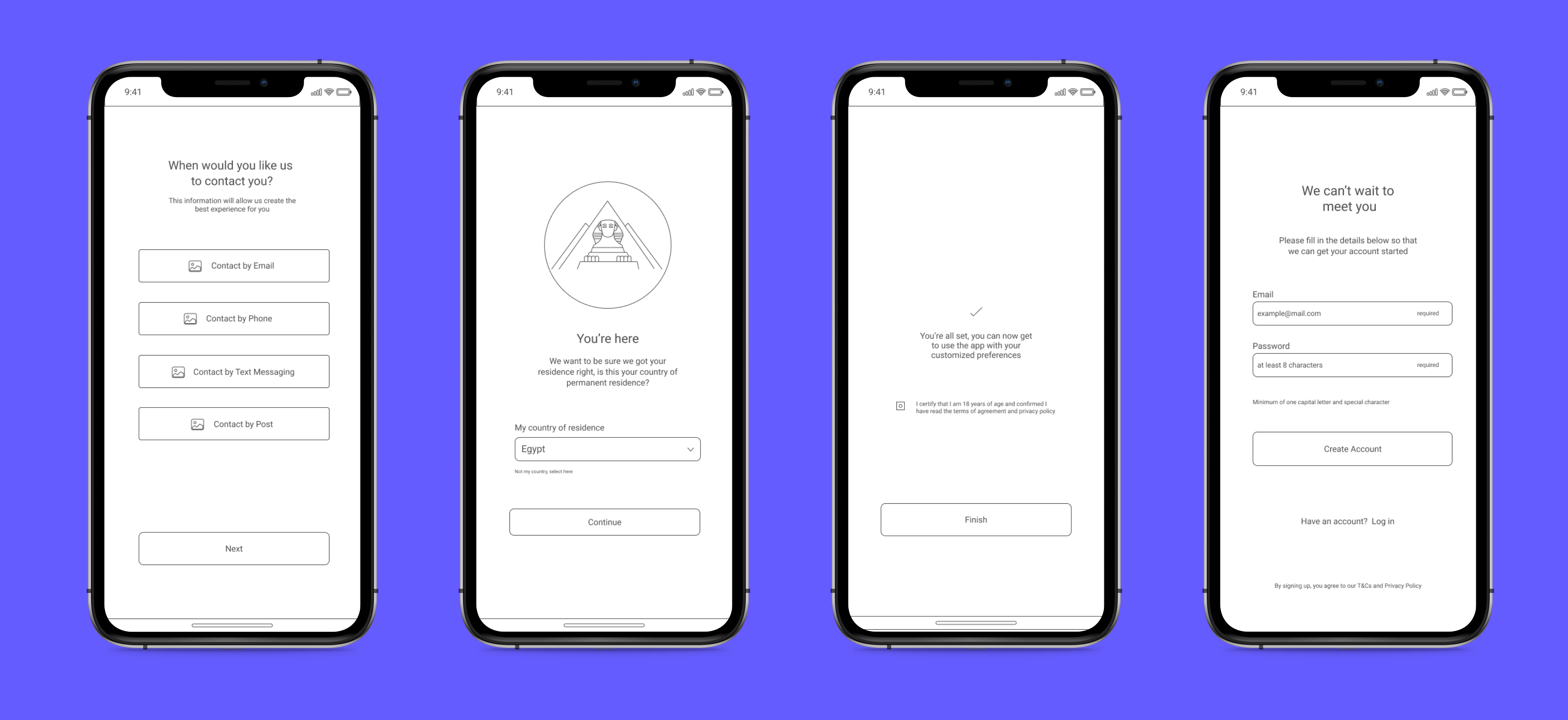
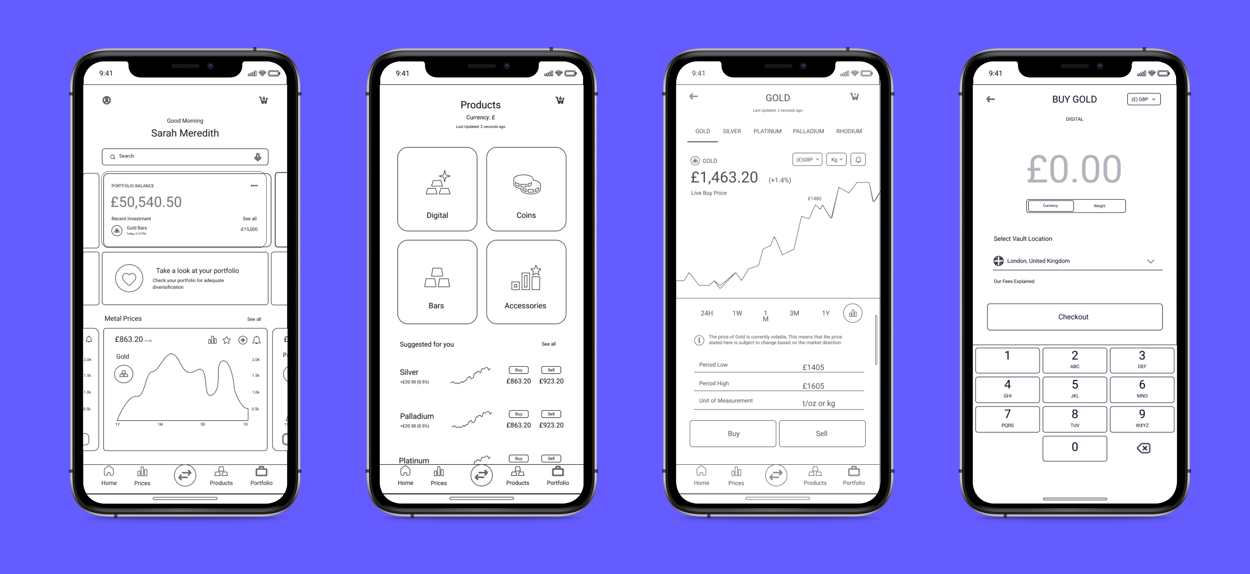
Wireframes
With wireframing, I set out the basic structure of the product. I think of it like what framing is to building a house, or a skeleton to the body. It supports the end product.
Visual Design
With the product taking shape, it was time to turn to its brand and style. In order to get a consistent visual message which resonates with and informs the user, I created a style guide which was influenced by the brand guidelines
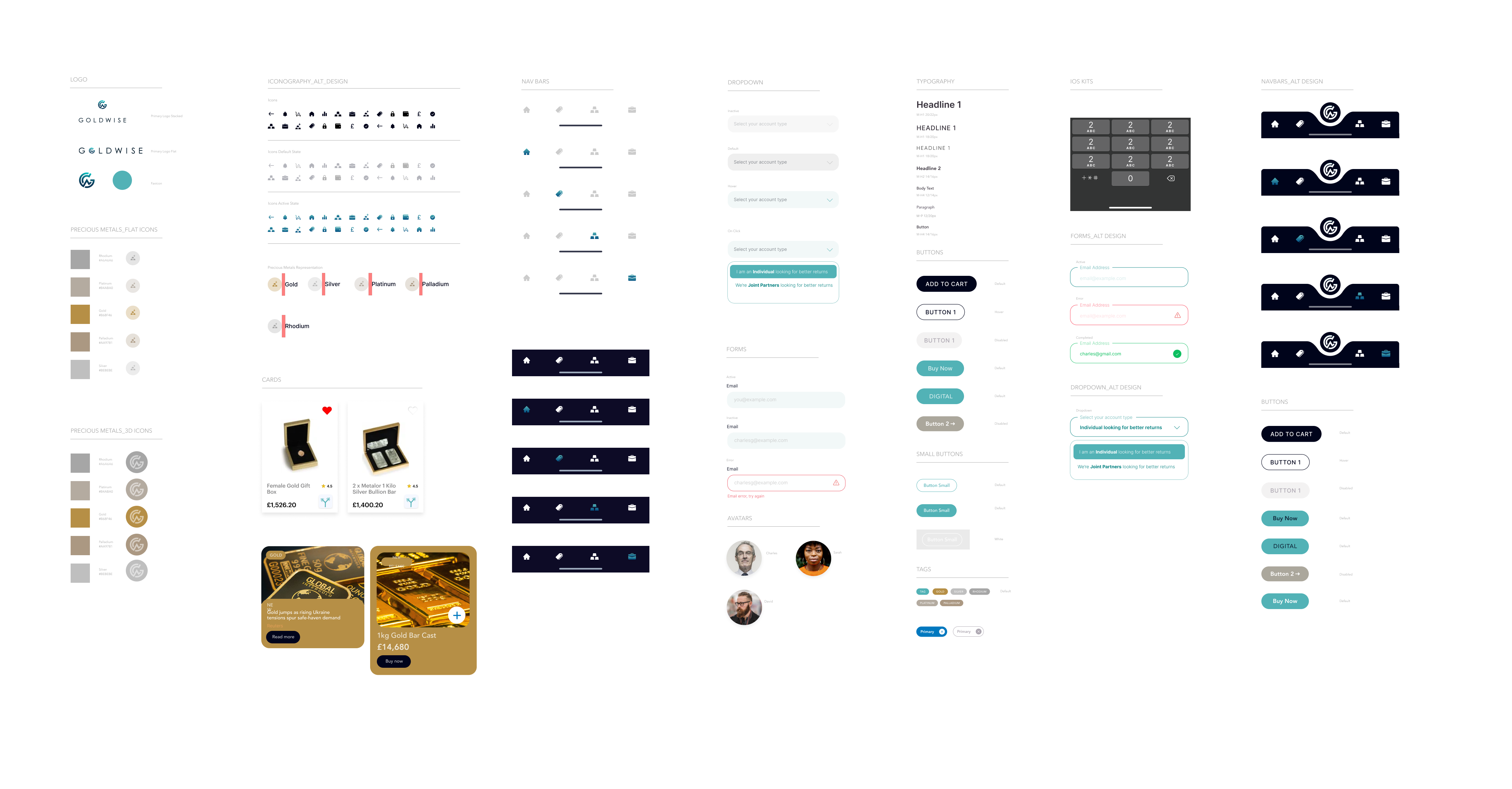
Style Guide
The style guide is the nitty-gritty of the visual design work, setting parameters and technical standards for a pixel-perfect visual uniformity.
Design Rationale
The design style of this project is influenced by the brand message. Goldwise is about empowering investors in their quest for buying, selling and investing in precious metals of their choice.
The GoldWise experience will be one that’s unique – it is a one app fits all for securely buying, selling, and investing in precious metals in real time, for the sake of efficiency. Therefore, clarity and simplicity is the name of the game.
Brand Theme
- Clean, simple, straightforward
- Advanced Trading Technological influence
- Bright and motivating
UI Kit
In support of this design, I decided to go with a UI kit. I am all about using tools at our service to create better design. While I used the kit, I also used it more as inspiration and a resource than a copy and paste resource. I chose the Singular UI kit because it matched my vision of the UI for GoldWise.
UI Colors
The primary color, blue, correlates to the overarching theme of launching. It also acts as the guiding line, the call-to-action thread throughout the user journey. Teal, the secondary color, I chose as the secondary color. It has a complimentary nature while also pointing to another brand goal which is user satisfaction and happiness. In line with the overarching goal of simplicity, the remaining colors are kept to a grayscale. White is featured heavily for a bright, clean user experience.
UI Elements
The UI kit I used came with a few 3D illustrations representing different metals. I decided to use these as they signify a new, innovative and forward-thinking mood. They are placed strategically on the prices and product list screens as they are the most visited page.Other than that, all elements match the clean and simple guidelines of the GoldWise brand. Shadowing is reserved to a few cards which are clickable but other than that, the overall design is a flat design.Lines are minimal, mostly 1px keeping in line with the minimalistic feel.Popups are used for messages and error warnings. These create a blurred background and clear next action/exiting.
UI Layout
All layout promotes visual hierarchy. The standard spacing is as follows with a few exceptions to aid a better feel.
- Margins: 40 px
- Header: 56 px (to allow for a 30px clickable logo)
- Buttons: Primary: 247×42, Secondary 124×44
- Related content: 36px or 42px depending on feel of page
- Footer space: at least 82px
- Box Margin: 24px
Font
The font I used is Inter. This sans serif font images the clean lines and slightly space-themed brand style.
- Title: 32 Bold
- Subtitle: 20 Semibold
- Body: 13 regular
- Button: 16 medium
Bringing Usability and Visual Design Together: High Fidelity Designs
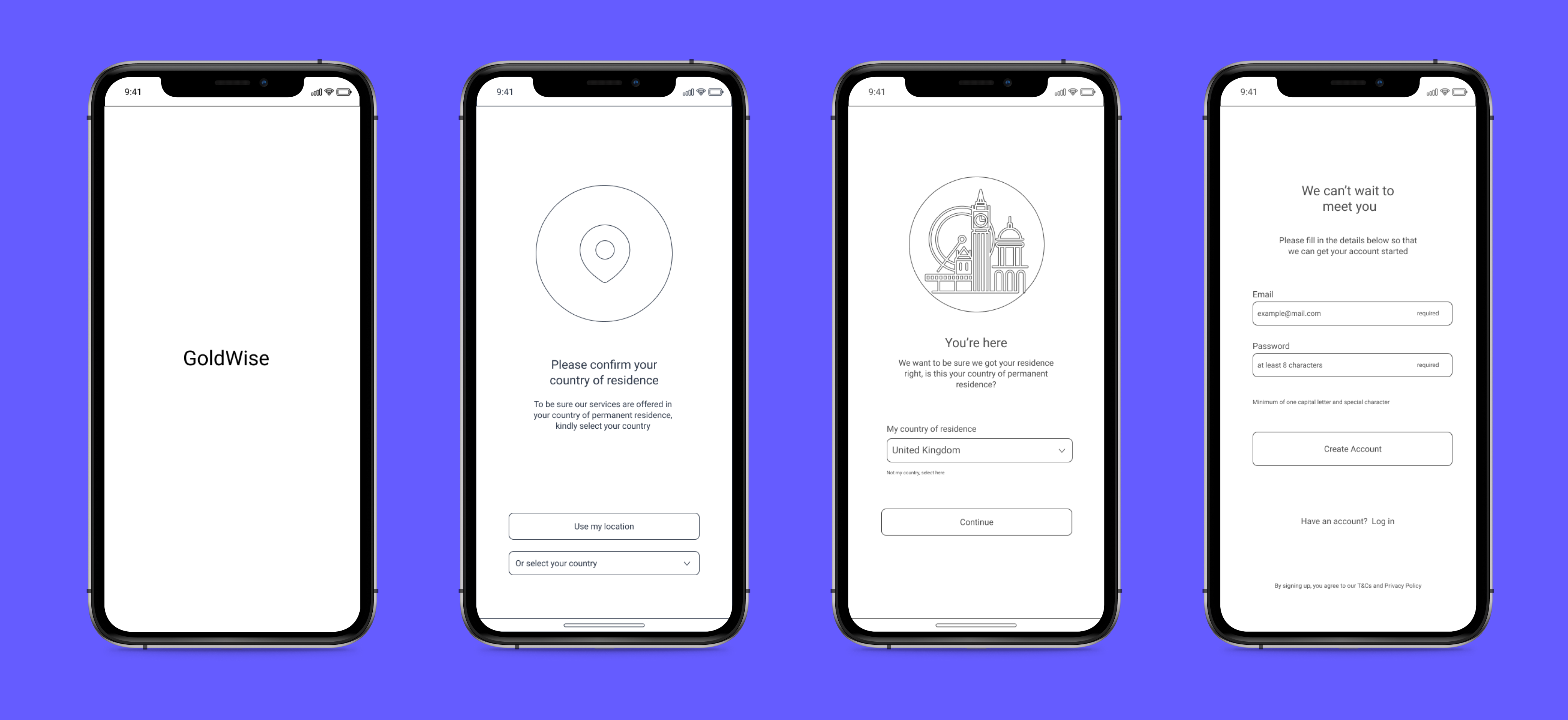
With the structure and style set through the work done with the usability design and visual design steps, I could start working on the high-fidelity designs. Using a UI kit and the style guide in conjunction with the wireframes from earlier stages, I worked out issues for it to be both usable, fit within the style guide, and accessible.
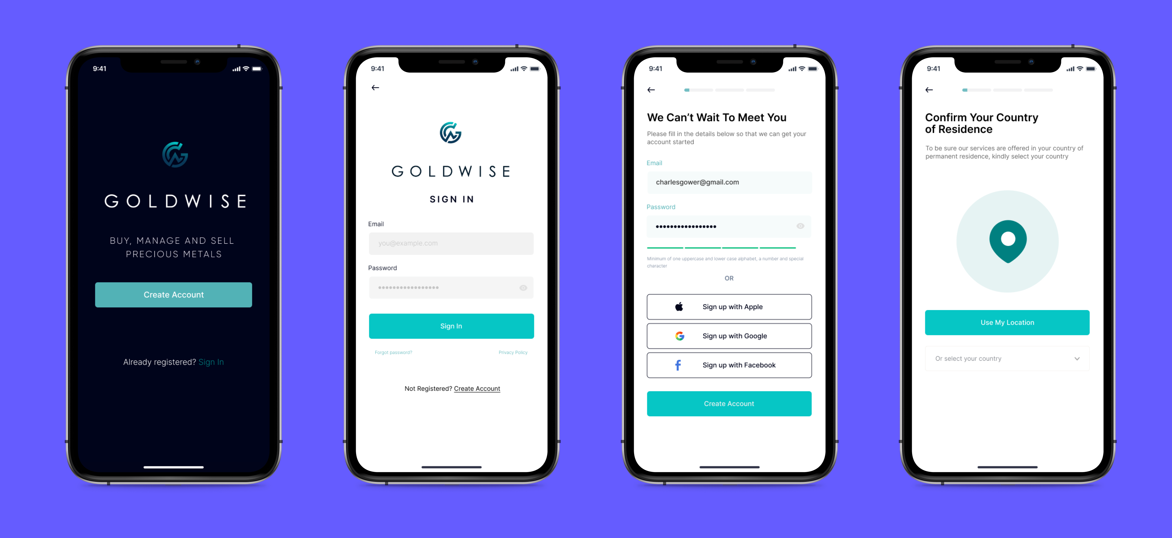
Accessibility Audit
After designing a few high fidelity pages, I ran them through an accessibility audit to check for color and contrast and screen reader readability, this passed the WACG 2.0 guidelines.
III. Validate
Validating
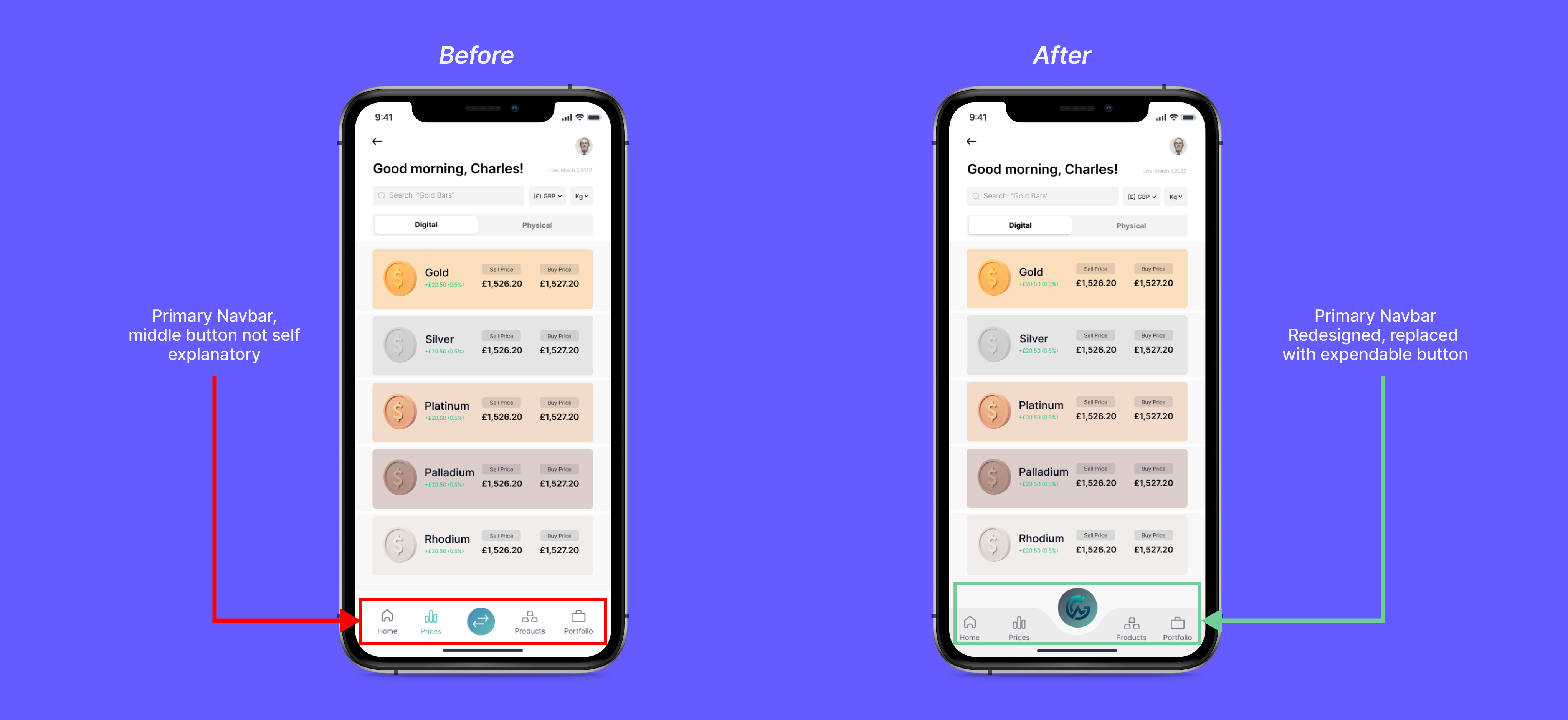
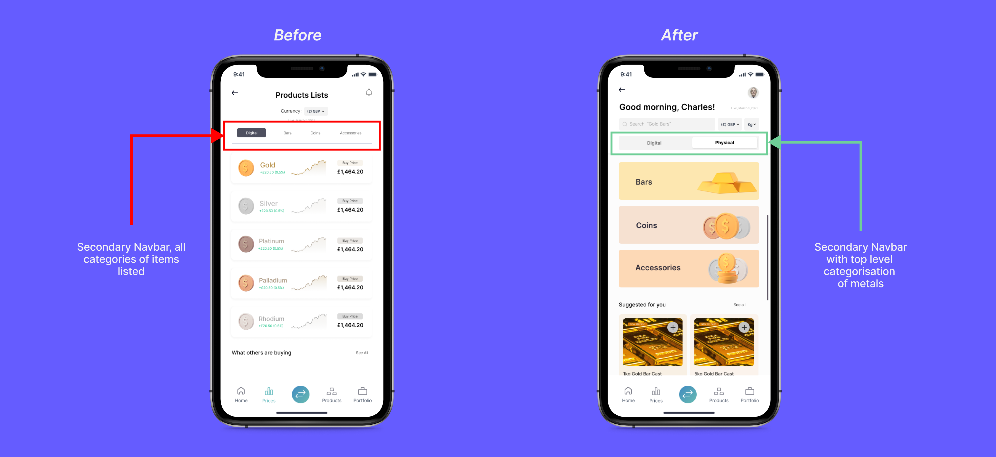
In the validation process, I created prototypes with the high fidelity designs and did two rounds of user testing with two groups of 5 participants with iterations after each round to incorporate the findings of each round.Each round of user testing was conducted over Zoom.
Prototype | Usability Testing 1 | Iteration | Usability Testing 2 |
The initial prototype was pretty straightforward. I used Figma to build the prototype and it went through the essential user routes(Onboarding, Buying and Selling) | The initial round of usability testing brought up 3 main usability issues. Issue #1 The prices page left much to be desired. All users found no clear path forward and lacking in essential information. Issue #2 The CTA on the product page was not as clear or accessible as it should be. Issue #3 Not enough support in the questionnaire regarding technical/industry knowledge. | The first round of prototype iteration worked on solving for the main issues brought up in usability testing round 1. | The adjustments made to the homepage clarified the user flow so that not one user asked about what to do or hesitated while on the homepage.Additionally, the information tested on one product detail page was helpful to the process and should be implemented into the other potentially unknown terms on the questionnaire.Finally, the biggest issue, and that of the results page, still has room for work but is much improved. Users no longer asked if this was the result as previously. One of the big flaws is that the two options are not well marked as to why they are both being suggested, aka, their difference isn’t indicated which was confusing for some users. |
IV. Reflect
To put my reflection into context, this project was the first major UX/UI work I had done in precious metal trading, it was a combination of experiences of ecommerce, trading tech and fintech. The whole project from research to delivery was an intense learning experience. A major takeaway for me was the lesson to start small.It was easy to get distracted by all the possible ways to solve problems in the field I’m solving for, as the technical knowledge is limited, Even with the product I delivered in collaboration with my team there is still much room for improvement.It was gratifying to see that by sticking to the results from my research, that is, listening to and learning from the user, a group of people were helped. By believing in the research, I got to witness the change of heart during usability testing when testers went into the testing skeptically saying things like, “I don’t think I’d trust another research on this” but who then ended by commenting that it would be a product that they would use.Research, focus, and reiteration – continual learning. That is the name of the game and lessons learned both from the Precious Metals Traders I worked with and from the project itself. I could ask for little else as a lesson at the end of a four-month-long project.
Learnings
- The key learning for me was to get the input of specialists in the field of study early in the research process, especially if it’s in a regulated field.
- There was no room for error or mistakes in design and code. Everything we did was backed by relevant data, verified and checked by the right healthcare professionals.
- I also learnt to Refine Interview questions to be more open-ended
Next Steps
I would explore further a lot of the concepts I played around with in my sketches and low-fidelity wireframes. The feature is built around the idea of collaboration on projects and organizations, so I wanted to explore the idea of displaying these in students’ profiles, which would be beneficial in helping students who may not have much professional experience and feel overwhelmed by LinkedIn to begin building LinkedIn profiles, which will benefit them in their job search.
References
Competitor Analysis | Nielson Norman | Invision | UX Adobe Ideas | Dribbble | Behance | WACG Guidelines | Apple HIA Guidelines | Double Diamond